
(Note: This article was originally published on February 18, 2022).
One of my frustrations when looking at data – whether part of Flight Data Monitoring or just in the media – is the use of ugly, confusing or, worst of all, misleading charts and graphs.
In most cases, it is not really our fault (except for those in the media that use tricks to intentionally mislead the audience). If you have a technical background, you probably learned some tips and tricks throughout the years either as part of your studies, or through your mentors.
But not everyone has that experience and even those that do may be used to preparing charts for a technical audience such as their peers. When preparing charts for a non-technical audience, there could be a tendency to make our charts look “pretty” to gain capture the interest of our audience.
I have been guilty of that myself over the years (we even managed to turn a Flight Data Recorder into our mascot!) but, as analysts – especially flight data analysts – we need to make sure that the data we are presenting is as clear and objective as possible. Trying to do otherwise can result in your audience questioning your motives or, even worse, your professional competence.
Don’t worry, though. Presenting factual information does not have to be dry and boring. In this blog, I have listed some tips that I have learned over the years that I think are great for those just starting out in their career. They also serve as a good refresher to those of us that have been doing this for a while – especially considering the poor (data) quality of charts and reports that we have seen in the media recently.
1. Use Titles and Units
One of the most annoying things to (not) see on a chart or graph is missing titles. Even if you think the title of your report is descriptive enough, include titles. Consider the two charts below. The chart on the left has a fairly descriptive title, but the chart itself is not very helpful.
First of all, which axis is Airspeed? And what is the other axis? It’s “probably” altitude, but what altitude? As the creator of the chart, you know the answers, but do not assume your audience does.
You may be tempted to argue that this chart is taken out of context and the details of the chart are included in the report. But charts are taken out of context all the time. Try to include all necessary details in your chart to avoid any confusion (or exploitation) of your data.
And don’t forget the units! You might KNOW that Airspeed is measured in knots, but your audience might not. Always include units with your axis so there is never any doubt.
With just a few simple changes, the chart on the right is much more helpful.


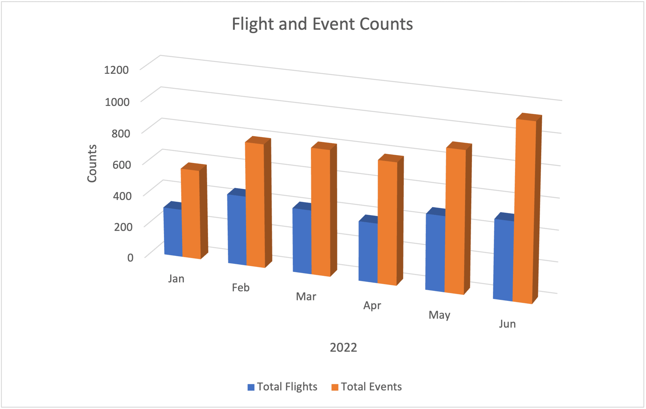
2. Avoid 3D Graphs
I am not sure why this is still a “thing” but I would love to see this one go away. Sure it looks cool – if it was 1994.
At best, this just looks like you are trying to show off your graphics skills rather than your data analysis skills. Trust me – you are a much better data analyst than you are a graphic artist.
At worst, 3D charts make the data difficult to read. For example, in the chart below, did we have more than 400 flights in March? To me, it looks like we had less than 400 flights (the actual value for March is 408).
Let’s all work together to rid the world of this horrible charting option.
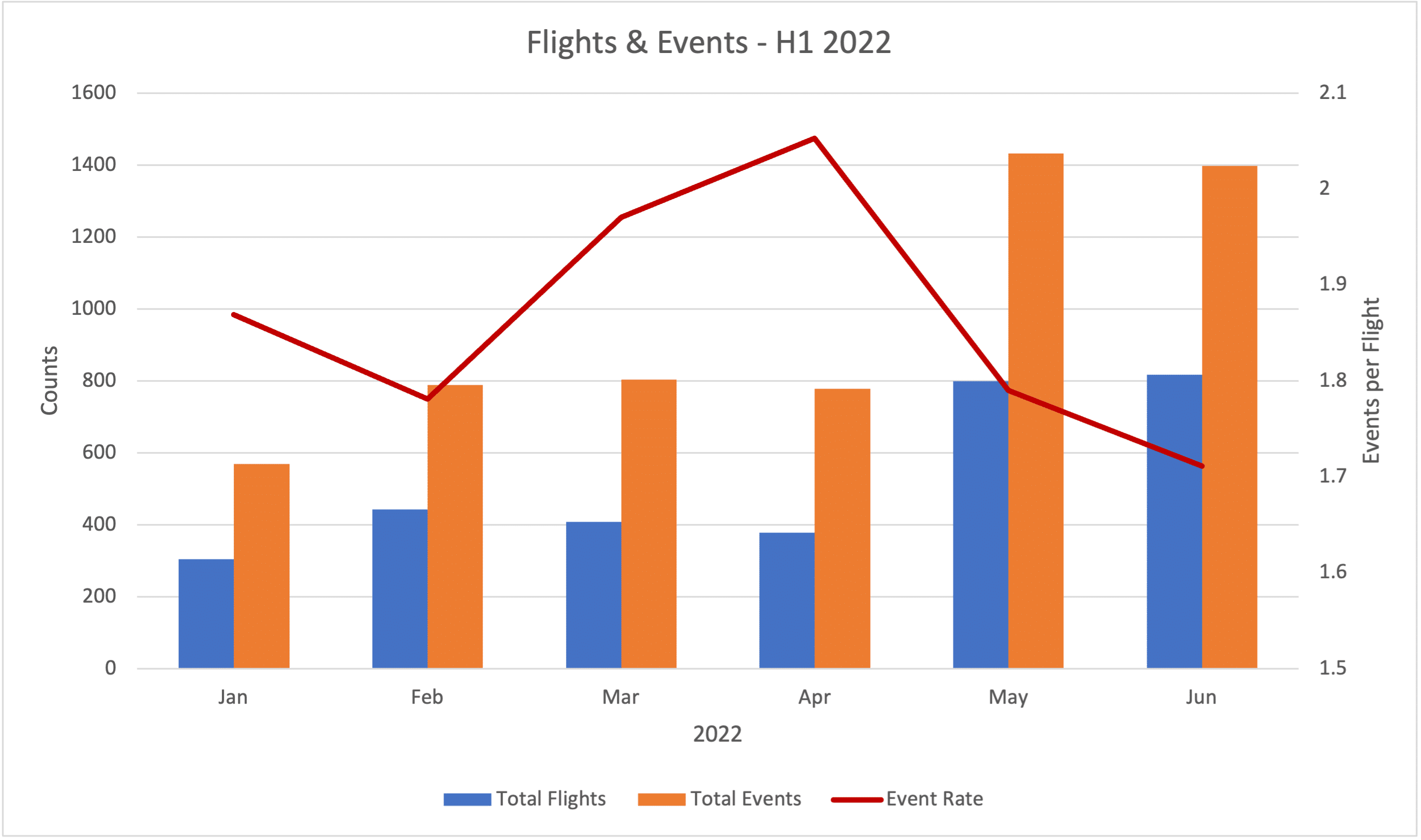
3. Consider Normalizing Your Data (But not Always)
By “normalizing” data, I mean this in the simplest of terms. Rather than looking at total event counts, for example, “normalize” it to a rate of “Events per 100 Flights” or “Events per Flight Hour”.
This is particularly useful if you have a growing fleet of aircraft or if the number of flights you have changes significantly in a given period.
Looking at the chart below, you will notice a spike in events in May and June, but there is also a spike in the number of flights. There could be a number of valid reasons for this, but just comparing event counts alone can be deceiving.
However, if we “normalize” that data and look at the number of events per flight, depicted as the red line, we can see that the trend is actually decreasing.

You do need to be careful working with normalized data, though. In general, it is helpful to get a better picture of how things are trending within an organization, but there are times when it could be more useful to look at the “raw numbers”.
For example, I recently published a case study in which a small airline had a serious issue with unstable approaches (you can get your copy of the report here). There was a relatively high number of approach related events that they did not address before adding an additional aircraft to flight operations.
Although the event rate did not change with the addition of the new aircraft, their odds of a serious incident did. In fact, they ended up going off the end of a runway shortly afterward. Only looking at normalized data may have hidden this additional risk.
There is no hard and fast rule to this – it is up to you as a data analysis to decide when one option may be better than the other.
4. Be Cautious When Using Partial Axis
This is an easy one to overlook. In fact, I almost overlooked it myself when preparing the example chart above for Item 3.
Below you can see the chart that I ‘almost’ included in Item 3 above. The exact same data was used to present the information as in the chart above, but notice the dramatic change in the event rate (the red line). It drops off considerably in May and June.
When I created this chart in Excel, it automatically set the axis range of my Event Trend Line – in this case from 1.5 to 2.1. In the chart depicted in Item 3, I deliberately changed the scale to read from 0 to 2.5. The actual values have not changed but we have effectively “zoomed in” on the data so the changes appear more pronounced.
I want to be clear that there is nothing necessarily wrong with limiting the range of your axis. It can allow you to present information that is easier to read, as we see in the examples above. In fact, this is a great technique which should be used. I would prefer to use the chart in immediately above (i.e. the one suggested by Excel) than the one I used for Tip 3.
Where you should be careful, though, is in situations where you are comparing two (or more) sets of data on a single chart. This is actually more common than it should be, in particularly in the media, and it can be quite deceitful.
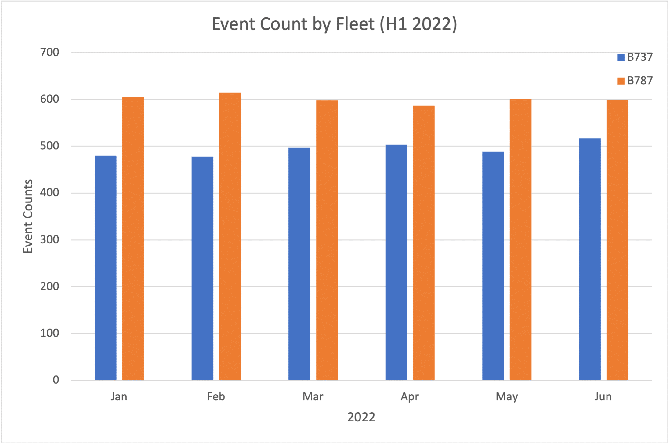
Consider the chart below comparing the number of events by fleet type. In this chart, things look much, much worse for the 787 aircraft than they do for the 737 aircraft. If you do NOT look too closely, you could conclude that, in some cases, the 787 has nearly 3 times the number of events as the 737.

But take a close look at the vertical axis. The axis only starts at 400 events. If we chart the data with the vertical axis starting at zero, we can see that there really is not that much of a difference between aircraft types. Keep this in mind when presenting data to your audience – as well as when reviewing data from sources that may have a hidden agenda.
5. Use Infographics Cautiously
This is a bit of an interesting one but definitely worth mentioning. We do not see a lot of infographics in data analysis, but as content producers look for more ways to make our data look more attractive, they are becoming more popular.
Infographics can be very effective tools for presenting data and gaining audience interest but, again, you must be careful to make sure that your message is presented objectively. Infographics can be easily misused and abused.
To illustrate this point, I’ve included a rather simple infographic representing the results of a fictional survey of beer drinkers around the world. Those beer drinkers were asked to identify their favorite type of beer. The results were tabulated and presented in the graphic below. Oh, and let’s say that this fictional study was funded by the “Brotherhood of Dark Beer Drinkers for Planet Earth”.
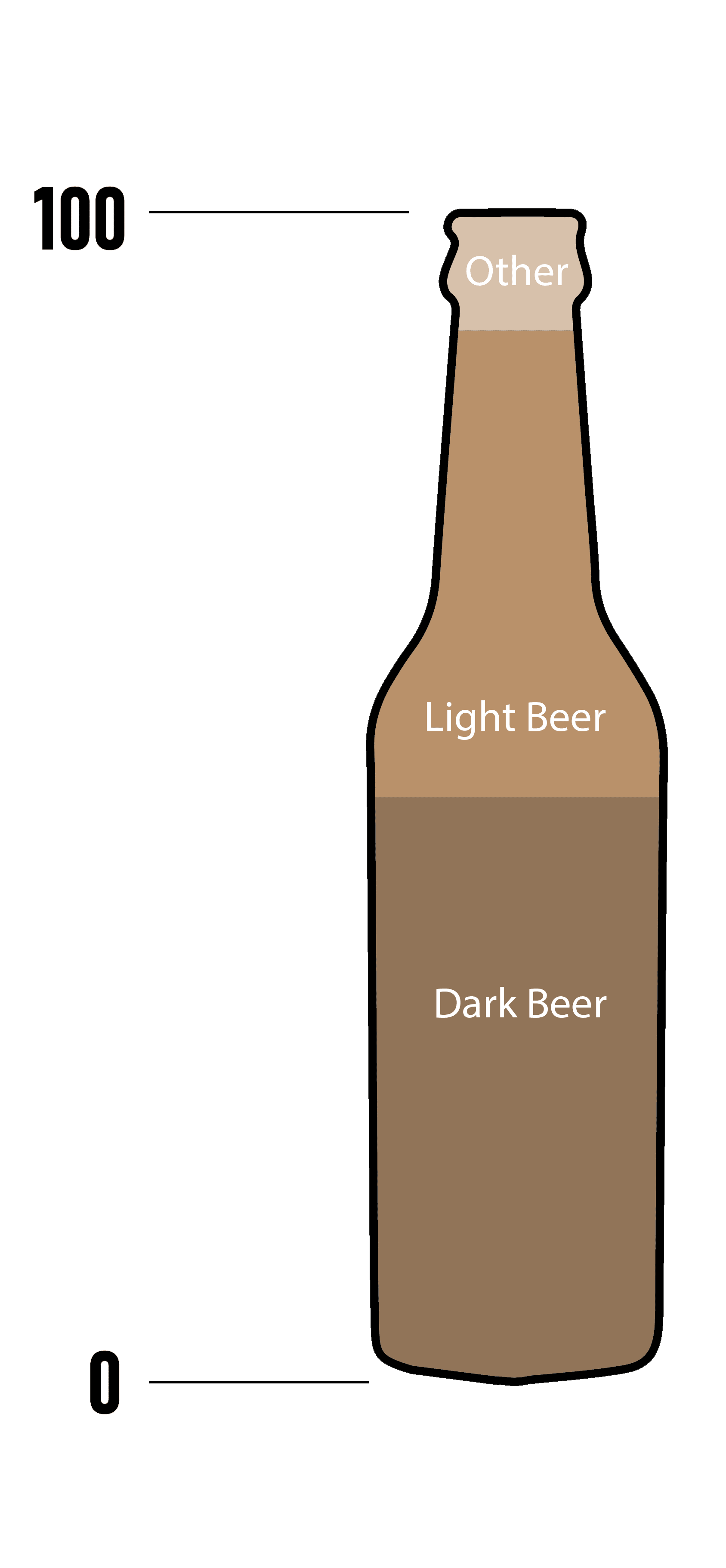
If, at first glance, you conclude that a large majority of beer drinkers prefer Dark Beer, you would be forgiven, but take a closer look at the graphic. Only roughly 50% of beer drinkers prefer Dark Beer, with Light Beer being a close second.
Representing data in this way can be deceiving, but we do see it more often now – particularly in marketing material.
We, as flight data analysts, should try to steer clear of the use of infographics for flight data analysis, but there certainly may be legitimate applications for their use such as in annual reports (I can see engineers and data scientists cringing right now).
If you do choose to use infographics, try to ensure that you still present the information in an objective and factual manner. If it appears as though you are trying to influence the reader’s opinion (whether intentional or not), you will quickly lose credibility.
Hopefully you find these tips useful. Remember that one of our goals as flight data analysts is to present our findings accurately and coherently. We want our charts to be clean and attractive, but this must never come at the expense of the readability or accuracy of the data.
If you have any other tips that are part of your personal list, I would love to hear them. Feel free to leave a comment below and fly safe!

Let’s keep in touch
Sign up to get notified of new blog posts, videos or other news and information related to flight data.

