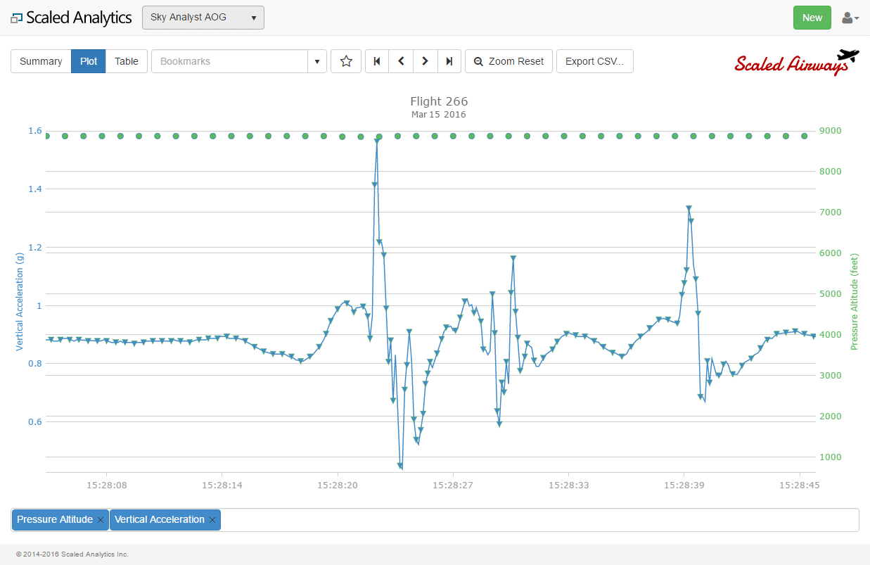
Data Conversion
Once flight data is recovered from an aircraft as part of a Flight Data Monitoring / FOQA program, it needs to be processed so it can be used for analysis. The data recorded on a flight recorder (whether FDR or QAR) is stored as a series of 1’s and 0’s. Before it can be of any use, it needs to be converted to meaningful engineering units such as Altitude and Airspeed.
This is accomplished through the use of a parameter database file or data map file. At Scaled Analytics, we utilize the industry standard FRED file, but most software providers have their own proprietary format they use to do this conversion.
Typical Flight Data Flow
How a FRED file is constructed and how it works is beyond the scope of this article, but an important note is that FRED files are normally aircraft type specific – but they even vary within a given aircraft type. For example, a FRED file for an A320-200 will not work on a 737-400. However, even on the 737-400, there can be half a dozen or more different FRED files that can be applicable to a particular registration. Before your software or service can make sense of the data, it will need to be configured with the FRED file that is appropriate for your specific aircraft.
Event Detection
Once the data is converted, it is then further processed by the Flight Data Monitoring / FOQA system. The typical system will go through a process of separating and identifying flights, identifying flight phases (Take Off, Cruise, Approach, etc.) and detecting events.
Detecting events is arguably the core of a Flight Data Monitoring / FOQA system. An “Event” is sometimes referred to as an “exceedance”. This would be a flight condition that has gone beyond the norms of the Standard Operating Procedures or operational limitations of the aircraft. Some examples of Flight Data Monitoring / FOQA events include:
- Excessive Bank Angles
- Low/High Airspeed on Approach
- Hard Landing
- Excessive Localizer or Glideslope Deviation
A Flight Data Monitoring / FOQA system will be configured with events that are applicable for a given operator’s aircraft types and type of operation. Events are certainly not cast in stone and can (or at least, should) be able to be easily modified as required.
Different vendors utilize different techniques and algorithms to detect FDM/FOQA events. Some vendors are better than others and all reputable vendors will consider their event detection algorithms proprietary information. And rightly so. A great deal of engineering and analysis work goes into developing a robust event detection engine.
Some vendors, including Scaled Analytics, also detect data points at various phases of flight for all flights – whether or not an exceedance or “event” has been detected. These are sometimes referred to as “snapshots” and are very useful for trending data during normal operations – not just when something goes wrong.
Data Validation
Once data has been processed, one of the first things an analyst will do is validate the data. In the past, an analyst would spend a good amount of his/her day validating the flight data and assessing whether or not detected events were valid or false.
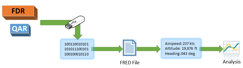
Data Spike in N2
Flight data, like any recorded data, can be subject to recording errors.
The image to the right demonstrates a “spike” in N2 after an aircraft has landed. This spike is most likely related to the aircraft shutting down after the flight, but such spikes may also occur during flight.
Issues with the recording system may also cause problems that would result in the Flight Data Monitoring / FOQA system generating a large number of false events.

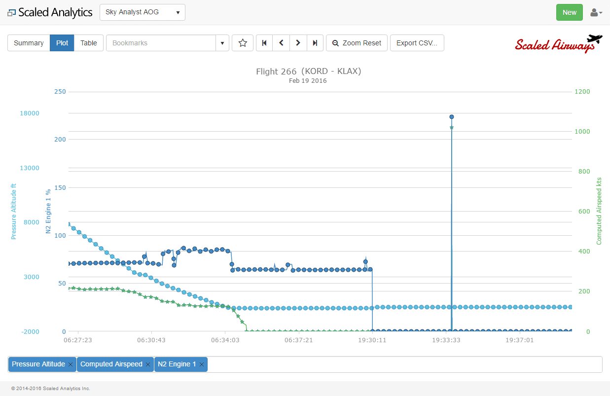
Problems with Pressure Altitude
The image to the left illustrates a problem with pressure altitude. This could be due to any number of issues including an error in the FRED documentation or a recording issue on the aircraft. Depending on the robustness of the event detection engine, a large number of false events could be triggered due to this questionable data.
Flight data today is certainly more reliable than it was 15 or 20 years ago. With a robust event detection engine, an analyst today does not need to spend nearly as much time validating events and data as one did in the past, but it is still a task that should be undertaken in some capacity to ensure the integrity of the results of the Flight Data Monitoring / FOQA Program. As the old saying goes, “Garbage In = Garbage Out.”
Bad Data or Turbulence?
Analyzing the Results
Once data is validated and the analyst has confidence in the data collected, it comes time to sift through the data and try to make sense of it all.
Unfortunately, this is an area where many organizations and service providers fall short. Many times, I have seen a report of the “Top 10 Events”. Numbers 1 and 2 are normally Taxiing too fast and descending too quickly above 10,000 ft. The decision makers look at reports like those and ask “so what”?
The real benefit to a Flight Data Monitoring / FOQA program – or any data analysis activity – is that a skilled analyst sifts through the data and makes sense of what is being collected. It is certainly beyond the scope of this blog to describe the thought process of an analyst with 20+ years of experience, but an experienced analyst looks at the “top level” data and knows what questions to ask and how to use the tools at his/her disposal to get the answers to those questions.
As a simple example, consider the traditional “Top 10 Events” report mentioned above. Assume that Unstable Approach shows up in the top 10 list. It would be easy to simply say we need to send a memo out to our pilots and perhaps spend more time in the simulator working on approaches until the trend improves.
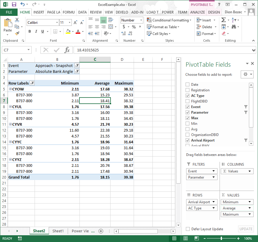
Using PowerPivot for Data Analysis
But an experienced analyst will start digging into the data to find more details surrounding the unstable approaches. He/she might ask (and find answers to) questions such as: Has this trend gotten worse over time? Is this related to weather? Is it related to a particular airport or region? Is it related to the introduction of a new fleet of aircraft? Etc.
Interestingly, during this analysis, Flight Data Monitoring / FOQA specific software comes less into play, making way for third party specialized data analysis and data mining tools such as Excel, SQL Server Business Intelligence and R Programming language (to name but a few).
For an example of how to use Excel’s PowerPivot for flight data analysis, check out our YouTube video.
It is with the analyst that a Flight Data Monitoring / FOQA program can truly improve flight safety. Otherwise, the program is just a system for collecting flight data. The analyst provides the information he/she has obtained by sifting through the data and presents it to the decision maker(s) in order to take steps to ensure the continued safe and efficient operation of the organization.
Telling the Story
Sample Chart
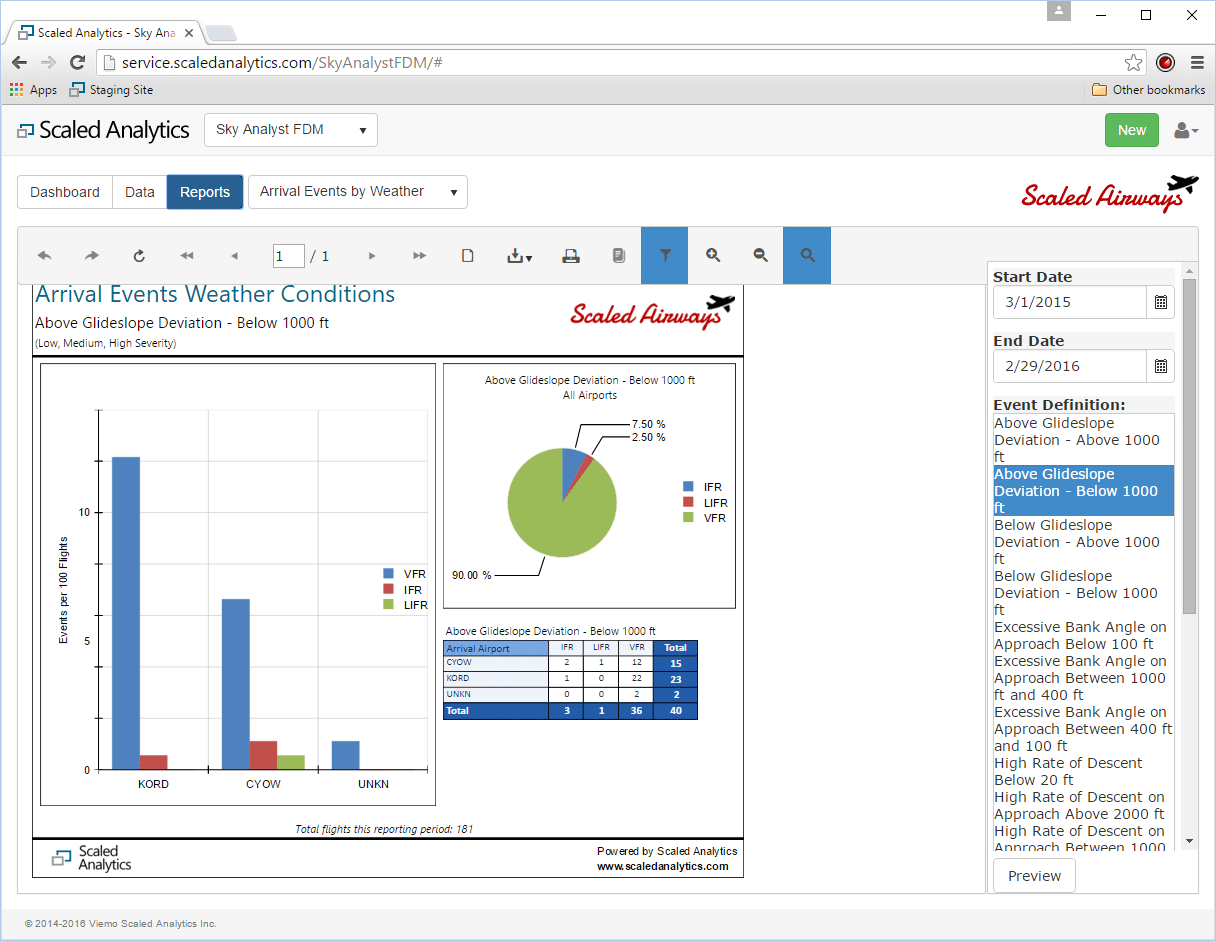
Of course, the analyst needs effective tools to report findings to those decision makers. Third party tools again come in handy, but many Flight Data Monitoring / FOQA tools also provide some good capabilities in this area.
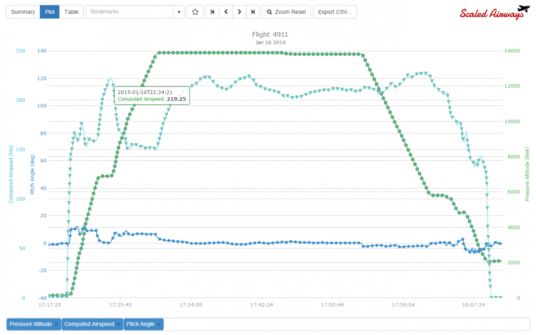
Charts are by far the most commonly used tool for assisting in the telling of the flight data story. A good chart can make the complex simple and easy to understand. Conversely, a poor chart can be completely incomprehensible or, even worse, tell a story that simply is not true. Again, this is where a skilled, experienced analyst is of tremendous value.
Finally, flight animation can also be used to help an audience understand the details of a specific flight. Although flight animation is quite popular because of its very nature, it is not particularly useful as an analysis tool. There have been rare cases where an animation has proven useful to understand an accident/incident, but it is mostly used as a presentation tool to help a primarily non-technical audience understand a specific flight. It is, however, still useful in Flight Data Monitoring to demonstrate a flight that may be representative of a trend that is being observed, or as a training tool to assist in demonstrating the ideal manner in which a particular maneuver should be flown.
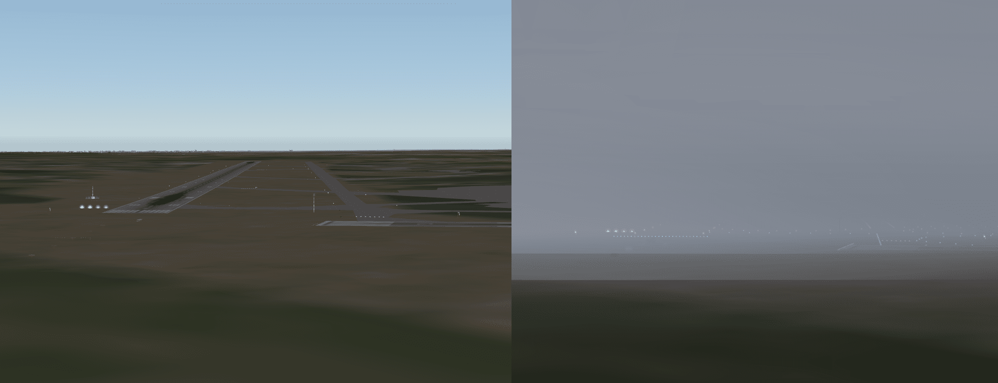
Using Animation to Understand Aircraft Misalignment in Poor Weather
While this blog is the longest in the series, it is so for good reason. Analysing flight data is the main purpose of a Flight Data Monitoring program. Event detection, data analysis and reporting one’s findings certainly make up the core of any program.
Despite the length of this article, it barely scratches the surface of the activities an analyst performs in his/her busy day or of the capabilities of a modern FDM/FOQA software system. Hopefully, however, it gives you a better understanding of how the data collected from a typical aircraft data recorder is used to help improve aircraft operational safety and efficiency.
In the next and final blog in this series, we will look at taking this information and “closing the loop” on our Flight Data Monitoring / FOQA program.
Flight Data Monitoring
Sky Analyst FDM is a modern, cloud-based Flight Data Monitoring (FDM) and FOQA solution for event detection, reporting and detailed analysis.
Helicopter FDM
From medivac to off shore oil rig operations, the helicopter environment is quite specialized and requires a special Flight Data Monitoring program – Helicopter FDM or HFDM.
Corporate FOQA
We know that as corporate operators you have different Flight Operations Quality Assurance (FOQA) or Flight Data Monitoring (FDM) requirements than airlines.